Loadout: E-commerce Store
Loadout is an e-commerce store that helps gamers discover and choose the right peripherals with confidence. The concept reduces decision fatigue through a clear information hierarchy, guided comparisons, and usability-focused design.
Loadout: E-commerce Store
Loadout is an e-commerce store that helps gamers discover and choose the right peripherals with confidence. The concept reduces decision fatigue through a clear information hierarchy, guided comparisons, and usability-focused design.
Loadout: E-commerce Store
Loadout: E-commerce Store
Year:
2025
Year:
2025
Year:
2025
Role:
UX/UI Designer & UX Researcher
Role:
UX/UI Designer & UX Researcher
Role:
UX/UI Designer & UX Researcher
Collaborators:
Solo project
Collaborators:
Solo project
Collaborators:
Solo project
Client:
Concept Project
Client:
Concept Project
Client:
Concept Project
Industry:
Gaming / E-Commerce
Industry:
Gaming / E-Commerce
Industry:
Gaming / E-Commerce
Project Duration:
10 weeks
Project Duration:
10 weeks
Project Duration:
10 weeks

Problem
Many gaming e-commerce sites overwhelm users with too many specs, unclear categories, and busy layouts. Data shows that cluttered sites can have up to 35% more cart abandonment and longer purchase times. This problem it hard for users to confidently compare products and complete purchase, especially for budget-conscious and time-poor gamers.
Initial Assumptions
Gamers demand deep technical details and personalisation.
Advanced filtering is a key driver for decisions.
Bold visual intensity captivates and accelerates engagement.
To test these ideas, I interviewed five active gamers, looked at buying trends, and studied other platforms like BT Games, Takealot, PlayStation Store, and Amazon.
Findings: Users wanted clear information, trusted content, and fast navigation. Most ignored technical specs and promotions.
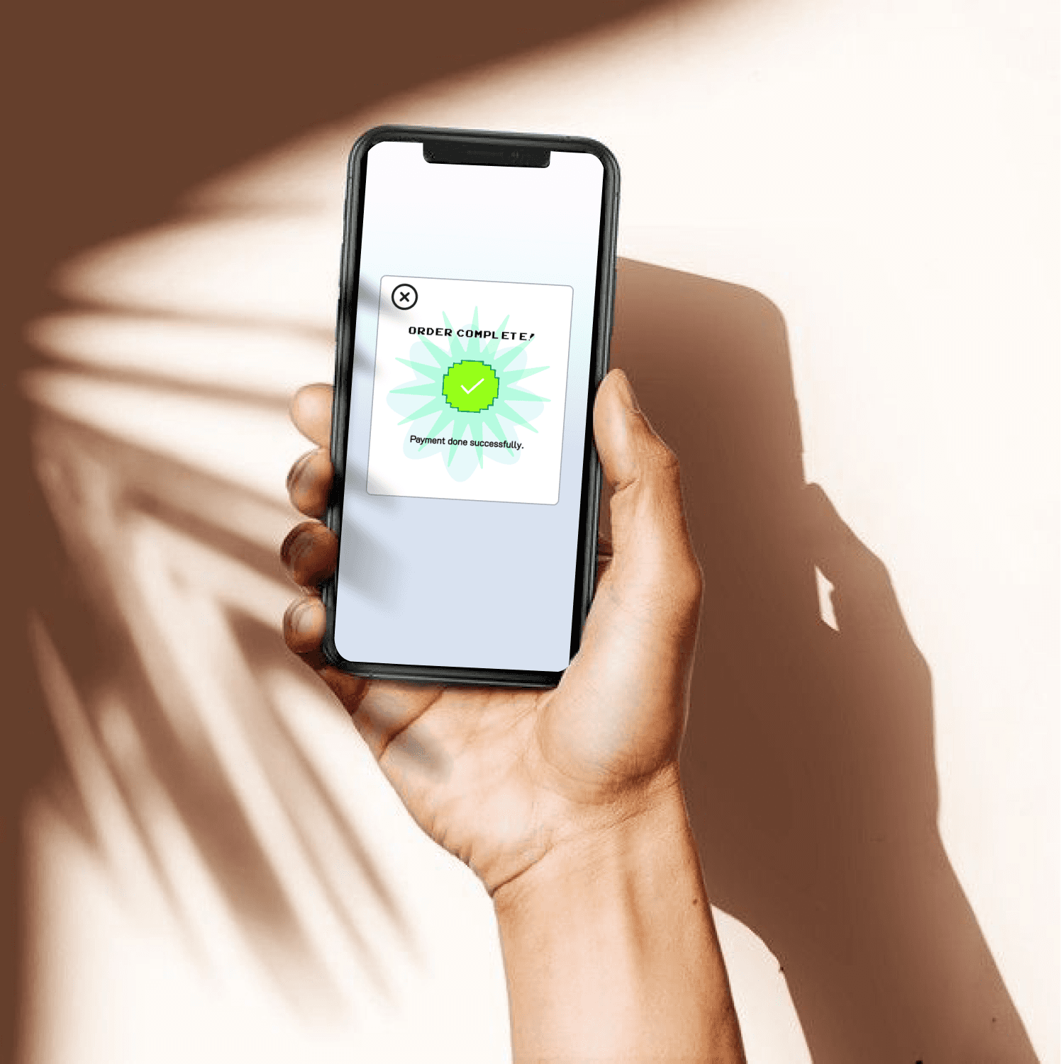
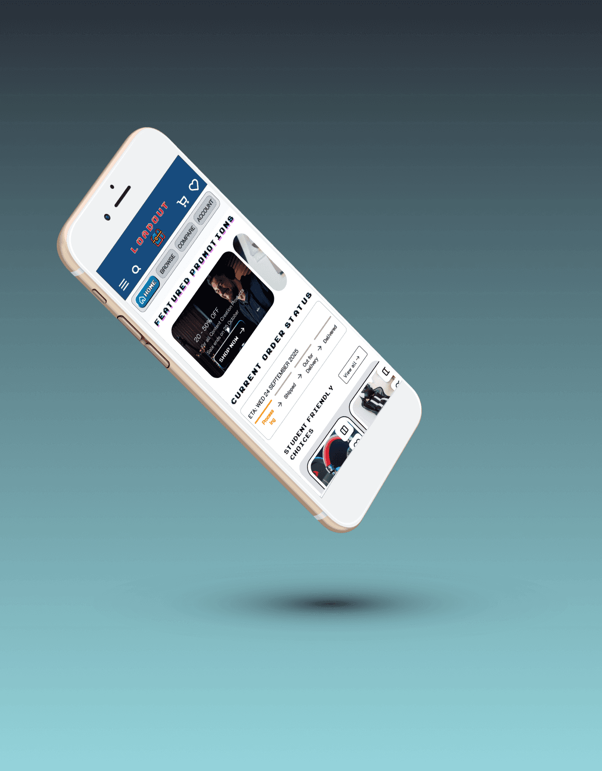
Solution
Design a mobile-first gaming store that focuses on clarity, accessibility, and quick decisions. It features better navigation, clear product categories, a simple checkout, and an easy-to-use layout for gamers.
Solution
Design a mobile-first gaming store that focuses on clarity, accessibility, and quick decisions. It features better navigation, clear product categories, a simple checkout, and an easy-to-use layout for gamers.
Solution
Design a mobile-first gaming store that focuses on clarity, accessibility, and quick decisions. It features better navigation, clear product categories, a simple checkout, and an easy-to-use layout for gamers.
Challenges
The main challenge was sharing enough product details without overwhelming users, while still meeting the needs of many different customers.
Designing for mobile meant focusing on the most important content, simple layouts, and easy navigation. Product comparison screens showed only the key details, so every platform stayed clear and easy to use.

Process
Research & Analysis: I created user personas, mapped out user journeys, and reviewed competitor sites to find usability gaps.
Information Architecture: I set up navigation, organized product categories, and designed the checkout flow to match how users shop.
Wireframing & Prototyping: I made simple prototypes to test the main user flows early on.
Usability Testing: Led moderated sessions with five participants, evaluating: Product comparison ease; Navigation clarity; User confidence; and Task Completions.
Visual Design: Based on what I learned from usability testing, I made detailed mock-ups with improved typography, stronger contrast, and WCAG AA accessibility.
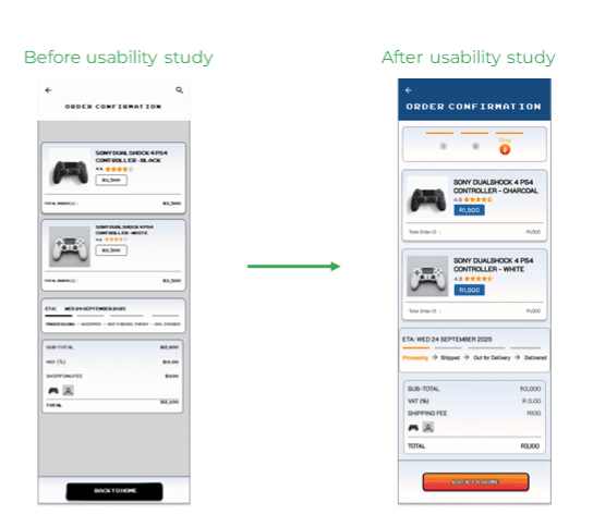
Design Decisions & Trade Offs
Feedback from usability tests showed that users needed easier-to-scan pages and clearer guidance, which shaped the following decisions during iteration:
Simplified product cards to highlight key decision criteria.
Added step counters to provide feedback about check out progress.
Limited typography to two typefaces for consistency.
Structured pages around use cases rather than brands or deals
Applied strong visual hierarchy to reduce mental effort.
Refined typography and layout using a 8px spacing system to improve consistency, reduce clutter and noise.
Increased the size of Call to action and made it sticky on product pages to make purchase easily within reach and quick.
Used progressive disclosure to prevent overwhelm.
Navigation has swipe and click inputs for speed and ease.
Deprioritised advanced features to prioritise usability and confidence for the core app experience.
Tools Stack


Results
Task completions increased from 60-100%
User Error Rate decreased from 60%-40%
Average Task on time decreased form 8:48 min - 4:37 min
Feedback: Users felt more confident and found checkout easier because of clearer progress indicators, better text contrast, and improved layouts.
These changes helped users finish more tasks, find information more easily, and make fewer mistakes. However, some users still had issues with the readability of the titles sections and product comparison page. This would impact decisions for future iterations of the product.
Key Insights
Unclear hierarchy made product comparisons mentally taxing and affected the user's ability to complete tasks.
Visual noise reduced trust instead of increasing engagement.
Users prioritised finding the right” product over the “best” product.
Research showed that users wanted reassurance and help with decisions more than technical details, so I changed the design to focus on clarity.
Conversion Rate
100%
Conversion Rate
100%
Conversion Rate
100%
User Error Rate
40%
User Error Rate
40%
User Error Rate
40%
Time on Task
4 min 37s
Time on Task
4 min 37s
Time on Task
4 min 37s
Outcome
The final design gives users a clear and welcoming way to shop for gear.
It guides users smoothly from finding products to buying them, making the whole process simple.
The modular design provided re-usable assets for scalability and adaptable ux flows for other e-commerce projects.
The project produced interactive prototypes and a reusable UX framework. Features like navigation, information structure, and guidance can help other tech accessory stores save time and improve user satisfaction.
Conclusion
The Loadout project shows that UX research, ongoing design updates, and accessibility can make e-commerce easier to use and help build user confidence, especially for niche groups.
Key lesson: It’s important to understand the field before designing solutions. Research showed that users cared more about confidence, clarity, and guidance than technical details. Questioning assumptions and focusing on user needs led to success.
Key Takeaway
This case study shows I can quickly learn new fields, test ideas with research, and turn user feedback into real UX improvements. By blending gaming culture with usability, I create solutions that make shopping easier and build trust.
Key Takeaway
This case study shows I can quickly learn new fields, test ideas with research, and turn user feedback into real UX improvements. By blending gaming culture with usability, I create solutions that make shopping easier and build trust.
Key Takeaway
This case study shows I can quickly learn new fields, test ideas with research, and turn user feedback into real UX improvements. By blending gaming culture with usability, I create solutions that make shopping easier and build trust.